
Static ads are the cheapest creative you can test on Meta, and the fastest to turn around.
A video can take days to brief, shoot and edit. A static can be rebuilt in twenty minutes, so you learn in hours instead of weeks.
There's a bigger reason too. Since Andromeda, Meta reads your creative to decide who sees it. Ten versions of the same message get grouped together and shown to the same people. Statics let you change the message completely while keeping production cost close to zero, which is how you reach new pockets of buyers.
So statics aren't the cheap option. They're the high-frequency option. We've shipped 5,000+ creatives across 20+ brands at 225 Media, and below are the static formats we see working right now, with live examples pulled from Motion in July 2026.
10 static ad formats working right now
Every example below was live in July 2026, pulled from Motion's library of DTC ads. We haven't seen these brands' numbers, so we're not going to pretend we have. What we can show you is how each one is built and why the format earns its spot. All example ads in this section: images via Motion.
1. Us vs Them
Put your product beside the alternative and let the contrast make the argument for you. Split the frame, your product on one side, the usual alternative on the other, and let your side win every row.

- First Day: "Is your kid compatible with their multivitamin?" Other vitamins score 0% with a red cross. First Day scores a 100% match.
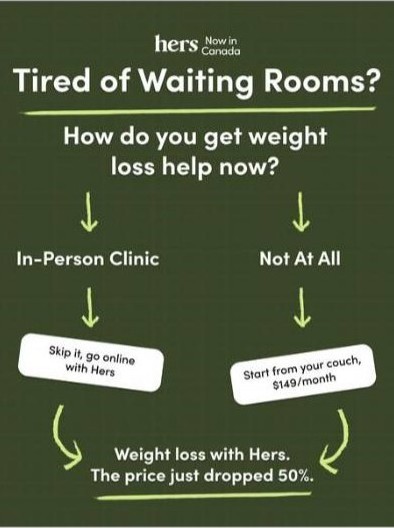
- Hers: "Tired of Waiting Rooms?" An in-person clinic and Hers sit side by side, each with its own path, ending on "Weight loss with Hers. The price just dropped 50%."
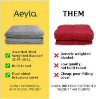
- Aeyla: "Aeyla vs Them", a two-column checklist. Green ticks on one side, red crosses on the other.
Why it works: the reader doesn't have to imagine the alternative, because it's right there losing. First Day turns a vague worry into a score, which is far easier to act on than a list of ingredients.
How we use it: this format was barely showing up in the live static pool in July 2026, with most brands running it as video instead, which is exactly why it's worth testing. For an Irish protein bar brand we work with, our split-screen static "Protein bars that don't taste like chalk" listed what competitor bars have (chalky protein powder, ultra-processed ingredients, rubbery texture) against what ours had (Irish milk protein, 12 ingredients or less, handmade in Ireland). It became our biggest-spending static for that brand: €1,534 spend, 63 purchases and a €24.35 cost per purchase, running from May to September 2026.
2. Bold Claim
One confident promise, front and centre. No hedging, no clutter, just the outcome.
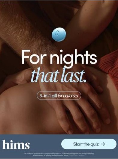
- hims: "For nights that last." with a small "3-in-1 pill for better sex" tag and a "Start the quiz" button.
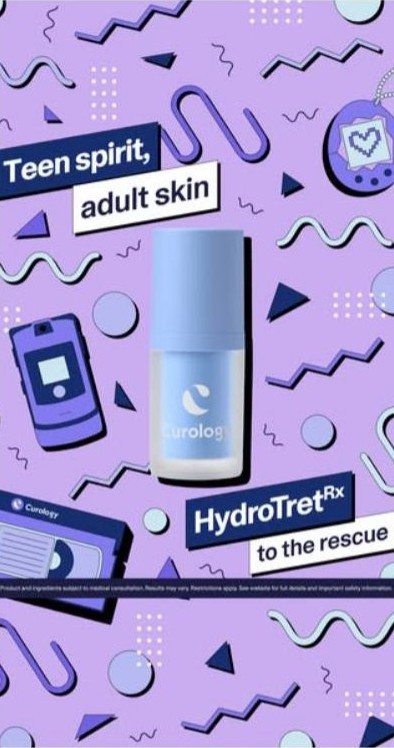
- Curology: "Teen spirit, adult skin. HydroTret Rx to the rescue", wrapped in a 90s-nostalgia design.
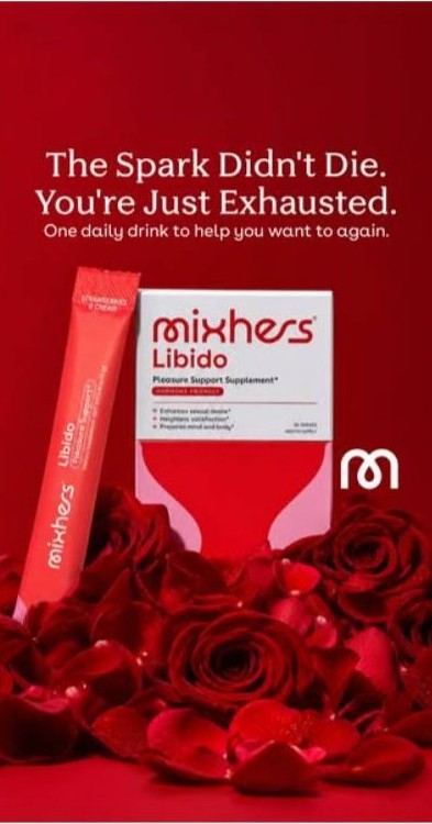
- Mixhers: "The Spark Didn't Die. You're Just Exhausted." over a bed of red roses.
Why it works: the claim is the biggest thing on the page, and everything else is supporting cast. Mixhers is the sharp one. It names the fear and replaces it with a reason that has a fix, in eight words.
Watch out: bold claims in health, skin and supplements carry compliance risk. Every one of these has small-print disclaimers, and yours will need them too.
3. iPhone Notes and other native screens
A native phone screen reads like a friend's honest take, not an ad.
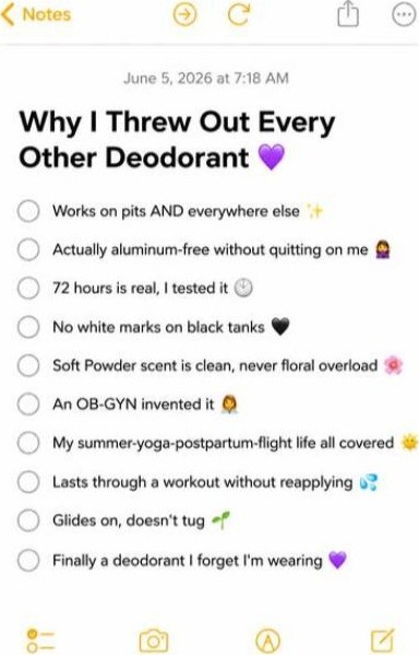
- Lume: "Why I Threw Out Every Other Deodorant 💜", followed by a ten-point checklist in first person. "72 hours is real, I tested it." "No white marks on black tanks." "An OB-GYN invented it."
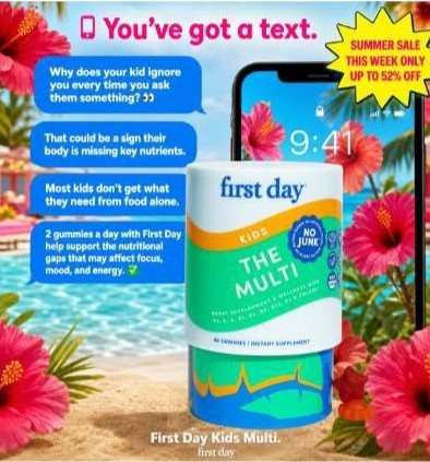
- First Day: "You've got a text." The message thread does the selling, framed like a phone notification.
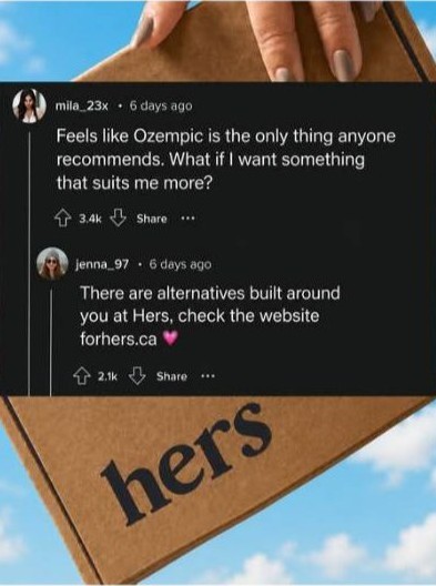
- Hers: a screenshot of a Reddit-style comment thread, where the recommendation comes from someone in the comments rather than the brand.
Why it works: it looks like something you'd screenshot and send to a mate. Lume writes every benefit as a personal reason, so it never feels like a feature list. That's ten objections handled without a single bit of ad design.
4. Features & Benefits
Turn the label into the layout. Scannable callouts let the value register in a glance.
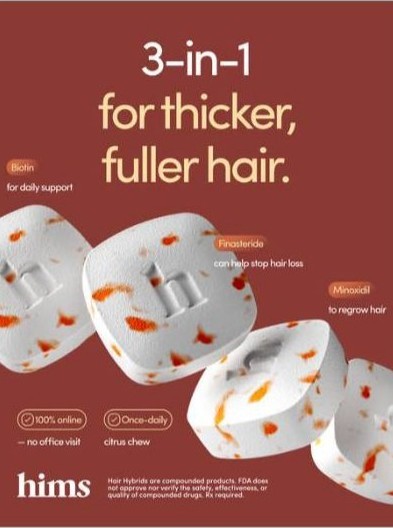

- hims: "3-in-1 for thicker, fuller hair." with each ingredient labelled around the product.
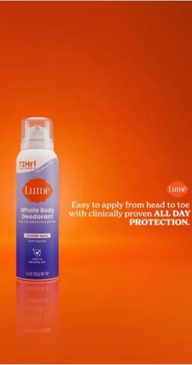
- Lume: the product on a bold orange background, with "easy to apply from head to toe" and "clinically proven all-day protection" as the only copy.
- Curology: "Try prescription skincare for $75 FREE", with the full routine laid out so you can see what $75 of value looks like.
Why it works: the hims ad is the clever one. The big line makes the promise, and the small ingredient callouts quietly prove it. Curology turns a feature list into a value stack, so the price does the work.
5. Before & After
Show the transformation. A visible result is the most persuasive proof a static can carry.
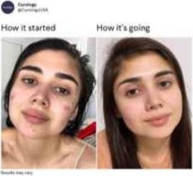
- Curology: "How it started / how it's going", the meme format, with two selfies side by side.
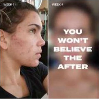
- A skincare brand: "Week 1 / Week 4" with "You won't believe the after" over the second shot.
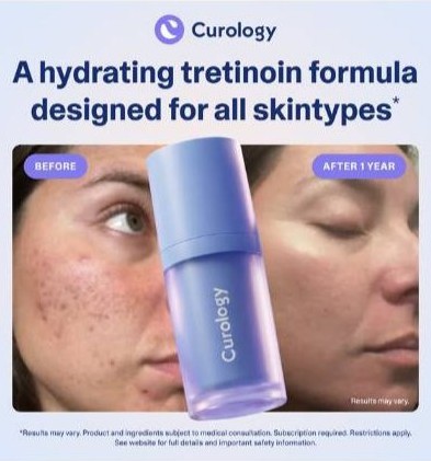
- Curology: "A hydrating tretinoin formula designed for all skintypes*", with a split face, "Before" and "After 1 year", and the bottle between them.
Why it works: the eye does the comparison instantly, and the time label answers the question every buyer has, which is how long until I see something. Borrowing a meme makes a result post look like something a person shared, not an ad.
Watch out: this is the format Meta polices hardest, especially for skin, weight and health. Curology carries "Results may vary" twice. Check Meta's policies on personal health before you run one.
6. Offer
Lead with the deal. A big, unmissable incentive does the persuading before the product has to.

- Curology: "Free* custom prescription skincare. Just pay $5.45 S&H + subscribe", with a 90-day money-back badge in the corner.
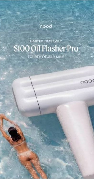
- Nood: "Limited time only. $100 Off Flasher Pro. Fourth of July Sale."
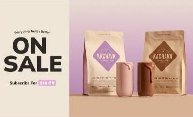
- Ka'Chava: "On sale", with a subscribe offer for $40 off.
Why it works: the reader does the maths in half a second. The guarantee on the Curology ad removes the risk at the same moment the price removes the cost.
How we use it: we run offer statics mostly to warm audiences. For the Irish protein bar brand, our best offer static was a phone-shot photo of five boxes stacked on a car seat with "Grab 5 BOXES! For the Price of 4" on top. "5 for 4" is clearer than a percentage for someone already doing the maths, and a casual photo reads like a customer's post instead of an ad.
7. Testimonial
Let the customer sell. A real voice, a screenshot or a star rating beats brand copy on trust.
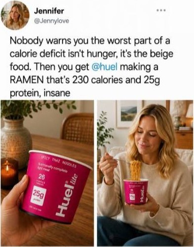

- Huel: a tweet-style post. "Nobody warns you the worst part of a calorie deficit isn't hunger, it's the beige food. Then you get @huel making a RAMEN that's 230 calories and 25g protein, insane."
- hims: a Reddit post on r/AskMen. "If you're even THINKING about a Turkish hair transplant, READ THIS FIRST."
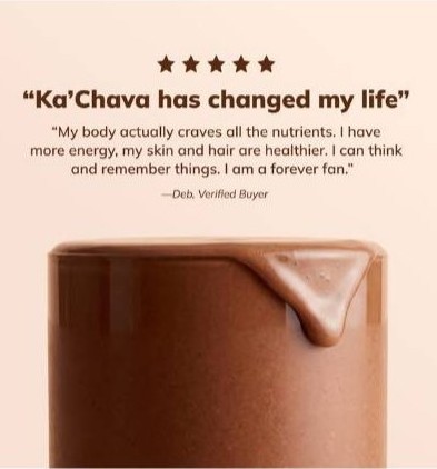
- Ka'Chava: five stars and "Ka'Chava has changed my life" from a verified buyer.
Why it works: a brand saying something is a claim. A customer saying it is evidence. The hims Reddit post is a masterclass. It's long, it's in the customer's own slang, and it handles the big objection ("I was going to get a transplant") before the product even appears.
8. Question
Open with the pain as a question so the reader answers in their head and stops scrolling.
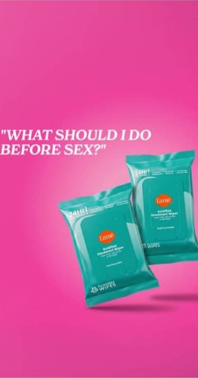
- Lume: "What should I do before sex?" on a hot pink background with the product floating in the middle.
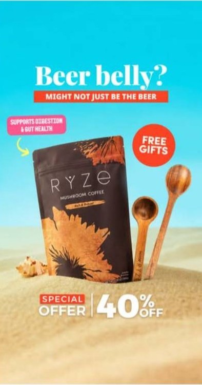
- RYZE: "Beer belly? Might not just be the beer", plus a gut health callout, free gifts and 40% off.
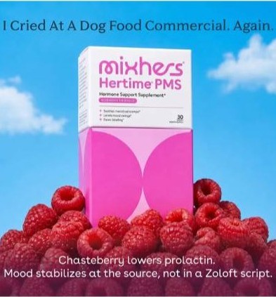
- Mixhers: "I Cried At A Dog Food Commercial. Again." The question isn't written, it's implied: why do I feel like this?
Why it works: a question forces self-selection. The people who stop are the people it's for, which keeps your clicks clean. RYZE goes one step further and flips the reader's assumption about the cause.
Our version: for the protein bar brand, our longest-running static is a question. "Why does eating healthy always have to taste like cardboard? It doesn't." It has run since May 2026 and is still live, at a €29.55 cost per purchase across 36 purchases.
9. Reasons Why
Stack the payoffs into a quick, scannable list the eye can finish in seconds.
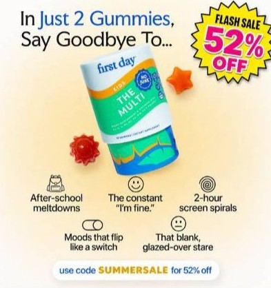
- First Day: "In just 2 gummies, say goodbye to...", with each thing you stop worrying about as its own line and a flash sale badge.
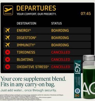
- AG1: a departures board. Energy, digestion and immunity are "boarding". Tiredness and bloating are "cancelled".
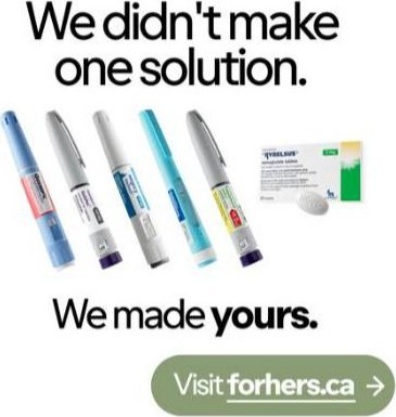
- Hers: "We didn't make one solution. We made yours.", with the range of options lined up underneath.
Why it works: each line is its own mini hook and the product is the answer at the bottom. AG1 shows how far a familiar frame can carry a list: nobody reads a departures board as an ad. Three reasons is plenty. Five is the max before it turns into a wall of text.
10. Sticky Notes
Handwritten notes feel personal and low-fi, which reads as authentic.
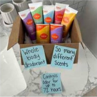
- Lume: a box of products covered in handwritten notes.
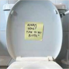
- Biotic: a single note stuck on a toilet seat: "Always here? Time to try Biotic+".
Why it works: handwriting breaks the pattern of a feed full of polished design, and a note in the right place tells the whole story. Biotic doesn't need to explain the problem. The location does it. This format is genuinely rare as a static right now, and these two were the strongest live examples we could find, which makes it a gap worth testing. AI tools make these quick to produce.
The format alone won't save a weak angle
One lesson before you copy any of these: we ran two apology statics ("We're sorry...") for the same brand. The one speaking to people who feel guilty about snacking hit a €25.75 cost per purchase. The one aimed at coeliacs came in at €51.62. Same format, double the cost, because the angle was different. Steal the format, not the ad.
How we build a static: the Build Order
A static is four decisions made in a set order: angle, line, proof, frame. Most brands make them backwards. They open the design file first and work out what to say afterwards.
- Angle. Who this is for and why they'd care. This decides which pocket of buyers Meta sends it to, and it's worth more than the other three put together.
- Line. The one line that stops the scroll. Write it before you open the design file. Keep it under about ten words and make it something a real person would say out loud.
- Proof. What makes the line believable. A review, a number, an ingredient list, a comparison or a before and after. Match the proof to the objection: a sceptic needs a review, a price-checker needs a comparison.
- Frame. The layout. Three levels at most: one thing read first, one read second, everything else recedes. Shrink it to thumbnail size. If it still reads, it works.
The call to action isn't a fifth decision. It falls out of the angle. If you're stuck rewording the CTA, the angle was never properly decided.
Go back through the ten formats above and you'll see a different decision carrying the weight each time. Offers ride on the angle. iPhone Notes rides on the frame. Testimonials ride on the proof.
Where our angles come from
- Winning videos. If a message works in video, we rebuild it as a static. Whole batches of our statics start this way.
- Customer reviews. We look for the pain that keeps coming up and use their exact words. Our coeliac headline came straight from customer reviews.
- Reddit. Search your category for phrases like "I hate that" or "anyone else struggle with".
- Competitor reviews. Five-star reviews show the benefits people care about. One-star reviews show the objections.
- Long-running ads in the Meta Ad Library. An ad that's been live for months is working. We take the idea underneath it, never the design.
AI is brilliant for producing layout variations at volume once the angle is decided. Here's how you can use it:
How we test and scale statics
We test one variable at a time, in the same order we build: angle, line, proof, frame. Change the headline, the image and the proof at once, and when one wins you've learned nothing you can use again.
- Test the angle first. Three genuinely different angles, one static each, with the layout and proof style held the same.
- Then the line. Take the winning angle and write four or five headlines on an identical layout.
- Then the proof. Same angle, same line. Swap a review for a number for a before and after.
- Frame last. It's the smallest lever, which is the opposite of where most brands start.
Give each version roughly 3x your target CPA in spend before you call it. If your budget can't cover that, run fewer versions rather than starving all of them. Then write down what you tested, what won and the number. In six months that log is worth more than any single ad in it.
When you find a winner, don't make twenty reskins of it. To Meta, a new background and a reworded headline are the same ad going to the same people. Change one decision at a time instead: a new proof element, a new format, or a video or carousel version of the same angle. We relaunched our us vs them static three times this way, and our five-boxes offer static was itself an iteration of an earlier winner.
When it starts to fade, you'll see frequency climbing while your cost per purchase climbs with it. That's when you need a new angle, not a new design.
The static ad mistakes we see in audits
The most common one: a picture of the product with a headline on it. No angle, no proof, just design. Here's what else comes up again and again.
- All the time goes on the frame. Teams polish layouts for hours and spend minutes on the angle. That's backwards.
- Twenty versions of one message. Volume feels like testing, but Meta groups similar ads together and shows them to the same people.
- Several variables in one test. If you can't say what made the winner win, you can't repeat it.
- Asking AI for the angle. AI is brilliant for layout variations and volume. Ask it for an angle and you'll get the average of your category, which is exactly what everyone else is running.
- Starving the best format. In one supplement account we audited this year, statics were the best-returning format (2.00 ROAS against 1.74 for video), yet they got only 24% of the spend. The top statics were also running at a frequency of 4 to 5, so the same people were seeing them over and over.
- One message on repeat. That same account had about 100 live ads saying just two things, with no offer at all. Their main competitor was running nine different arguments and three offers.
Quick test for your own account: pull your last ten statics and score each one out of four. Was the angle, the line, the proof and the frame genuinely decided, or just defaulted? Then ask which of the four you spent the most time on. If it's the frame, you've found your problem.
How we make static ads for clients
At 225 Media we find the angles, write the lines, design the statics and test them one variable at a time, so you know exactly what moved your CPA. Statics sit inside a wider mix with video and UGC, run through our video and static ad production and planned by our creative strategy and testing team.
For one ecommerce brand, that system cut CPA by 58% and grew new customers by 50% in four months, on the same ad spend.
Want statics built and tested for your brand?
Book a Creative Diagnostic. It's a live teardown of your ad creative on the call: which statics are carrying your spend, which angles you're missing, and what we'd test next.
Book a Free Creative DiagnosticA live teardown of your ad creative, on the call. No obligation.FAQs
What is a static ad?
A static ad is a single still image ad, with no video or motion. On Meta it usually combines a product image, a headline and a supporting line or proof element such as a review, a number or a comparison.
Do static ads still work on Meta?
Yes. Statics are the cheapest creative to test and the fastest to change, which matters now Meta uses the creative itself to decide who sees an ad. In one supplement account we audited this year, statics returned 2.00 ROAS against 1.74 for video.
What are the best static ad formats for ecommerce?
The 10 we see working are Us vs Them, Bold Claim, iPhone Notes, Features & Benefits, Before & After, Offer, Testimonial, Question, Reasons Why and Sticky Notes. Us vs Them and Sticky Notes are under-used as statics, which makes them worth testing.
How many static ads should I test at once?
Test three genuinely different angles first, one static each, with the layout held the same. Give each roughly 3x your target CPA in spend before calling it, and run fewer versions rather than starving all of them.
How do I stop static ads fatiguing?
Change one decision at a time on a winner (a new proof element, a new format, or a video version of the same angle) rather than making reskins. When frequency and cost per purchase climb together, you need a new angle, not a new design.